
![]() A couple of weeks ago, I wrote an Inside Tip about a simple way to add depth to text by rotating it along the Y (vertical) axis.
A couple of weeks ago, I wrote an Inside Tip about a simple way to add depth to text by rotating it along the Y (vertical) axis.
In this article, I want to pick up where that tip left off and explore several additional text tricks you can use in your projects.
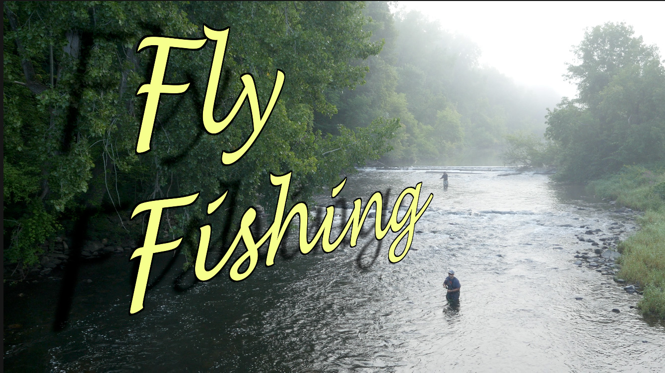
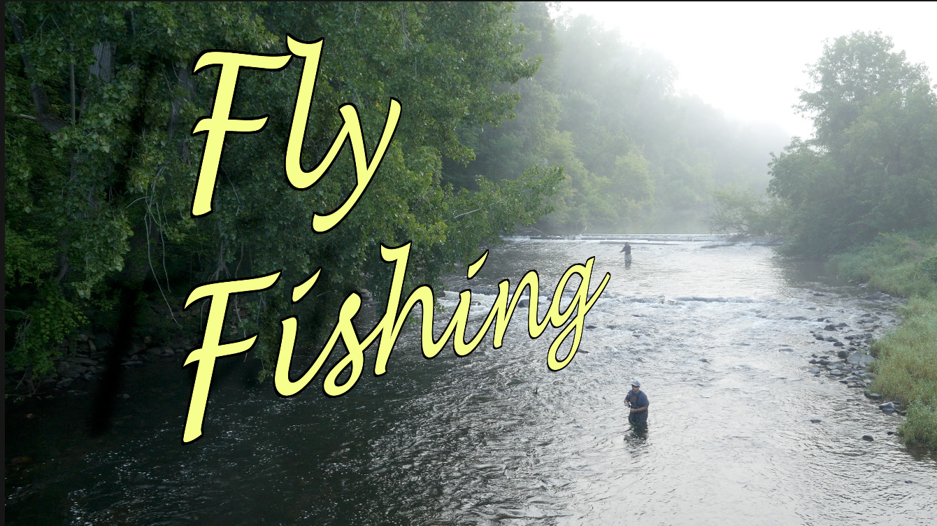
Here’s the image I’m working with, courtesy of drone footage shot by Terry Holland, about fly-fishing in New England.
Changing position and color are common tasks which I used here, both located in the Text Inspector. However, I also added effects that are a bit more unusual.
ROTATION & SCALE
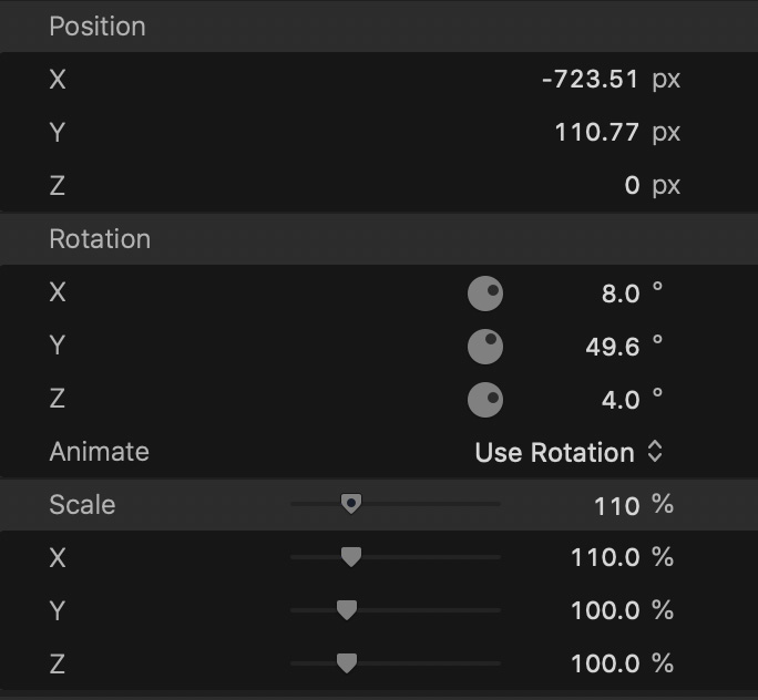
We are all familiar with changing the position of text to best fit within a project. I won’t belabor the obvious here.
This image, though, has a huge wall of trees along the left side with two fly-fishermen in the middle of the frame. So, I rotated:
I am NOT! a fan of stretching text – it comes from my experience working in a type foundry many years ago. In most cases, the shape of text should be used as it was first designed. But, here, slightly stretching (X xcale) the horizontal aspect of the text helped it flow back into the frame.)
OUTLINES
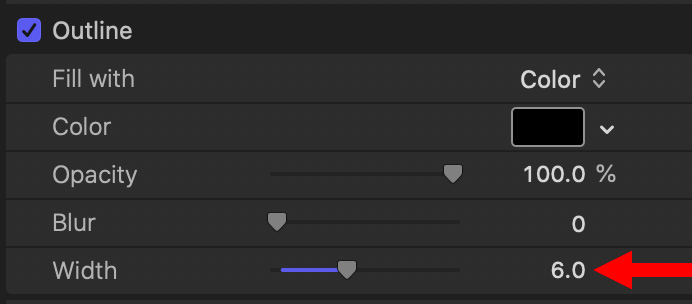
Because I have separate plans for the drop shadow, I needed to make the pale yellow of the text readable against the brightness of the water. So, I added a thin, black outline.
You can’t see it against the trees, they are too dark. But you can see it against the water, making sure that the viewer can easily read the title of my program.
DROP SHADOW
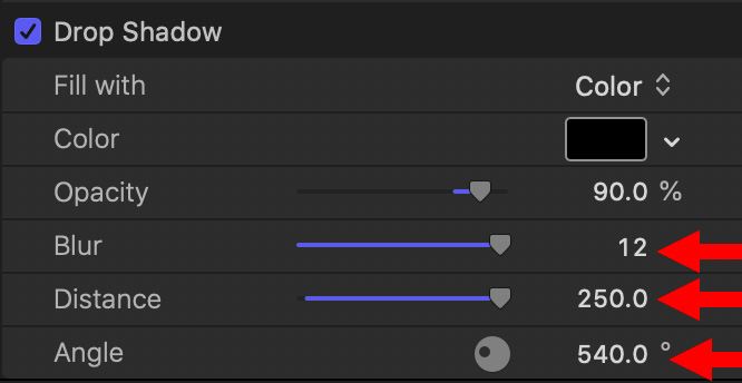
Normally, I use a drop shadow to improve the readability of text. But, in this example, I want to use the Drop Shadow setting to create a “cast shadow.”
NOTE: Here’s an article that describes how to create cast shadows for objects other than text in Final Cut Pro.
So, I changed the drop shadow angle to cast the shadow against the trees. Then, entered a manual value into both Blur and Distance, because dragging the sliders did not give me the amounts that I needed to make the shadow soft and distant enough.
NOTE: While I like how the shadow appears against the trees, I don’t like how it looks over the water. This is why I like using separate cast shadows because I can crop that part of the shadow that I don’t need, which I can’t do with the drop shadow setting for text.
Here’s an example of what I mean, using a separate cast shadow, cropped using Draw Mask to only appear against the trees.
NOTE: Here’s an article that explains how to use Draw Mask.
SUMMARY
The purpose of this article is to give you ideas for using text using settings you may not have played with before. Most of these settings – except Rotation and Scale – can be animated using keyframes. (You CAN animate these settings using Motion, however.)
There’s also a secondary point: To remind you that if a slider doesn’t go far enough, you can enter values manually to achieve the effect you need.

2,000 Video Training Titles
Edit smarter with Larry Jordan. Available in our store.
Access over 2,000 on-demand video editing courses. Become a member of our Video Training Library today!
Subscribe to Larry's FREE weekly newsletter and
save 10%
on your first purchase.
One Response to Text Tricks in Final Cut Pro
Neat!