 Helvetica is a very boring font. Not because it is poorly designed, but because it is overused.
NOTE: Helvetica was designed in 1957 by Max Meidinger as a “neutral typeface that had great clarity, no intrinsic meaning in its form and could be used on a wide variety of signage.” (Wikipedia). Linotype named the design “Helvetica” in 1958.
Emotion is a key element of many of the stories we tell in pictures. We spend hours thinking about sets and costumes and lighting – all to convey a feeling – yet miss the obvious emotions that can set a tone right at the beginning of our project by picking the right fonts.
While a study of typeface design can fill a book – and, in fact, has filled many – here are some key ideas to think about.
TYPES OF FONTS
There are four broad categories of fonts:
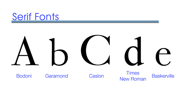
Serif fonts have little “feet” at the ends of each character. This aids the eye in moving from one glyph (letter shape) to the next.
These letterforms originated with the Romans carving words into stone.The outlines were first painted onto the stone, then the stone carvers followed the brush marks adding flares at stroke ends and corners, creating serifs.
For example, look at the feet at the bottom of the “A” or the jaws of the letter “C.” Another attribute of serif fonts is the different thickness in the character shape, easily seen in the letter “e”.
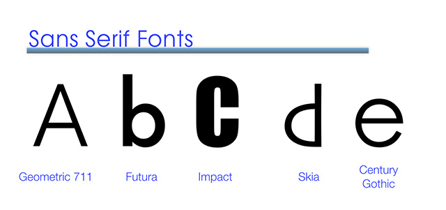
Sans Serif fonts are, surprisingly, fonts without the little feet. (“Sans” means “no” – therefore, no serif.)
Notice how clean each letterform is, no feet, with very even widths across the entire glyph. Compare the letter “e” in Baskerville (serif) to Century Gothic (sans serif).
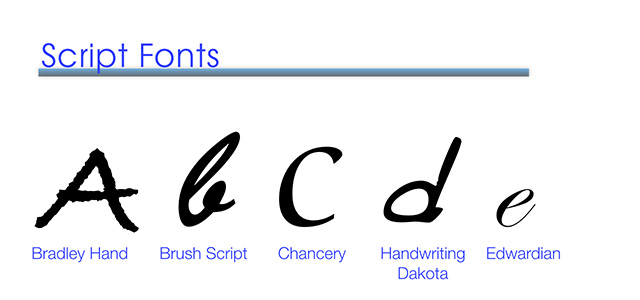
Script faces are designed to look like they are hand-drawn. Some are very formal, while others are very casual.
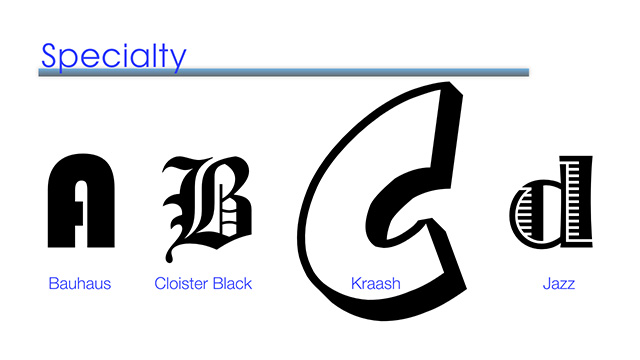
Specialty faces are very egocentric – they purposefully call attention to themselves – as you can see here. These fonts are designed to leap off the page, grab you by the throat and shake you until you pay attention.
Subtle, they are not.
MONOSPACE VS. VARIABLE
There’s one other characteristic of fonts worth considering: letter-spacing. Those of us “of a certain age” may remember mechanical typesetting machines called “typewriters.” (Yes, these primitive machines did exist – I used them for years.)
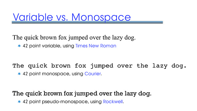
Here are examples of monospace, where each letter is the same width (similar to a typewriter), variable, and pseudo-monospace. Rockwell emulates the look of a typewriter, while still saving space on the line.
The big advantage of monospace is that it is easy to create type with a mechanical device like a typewriter. However, variable fonts cram more letters into the same amount of space, saving paper for books, or making the text easier to read on screen.
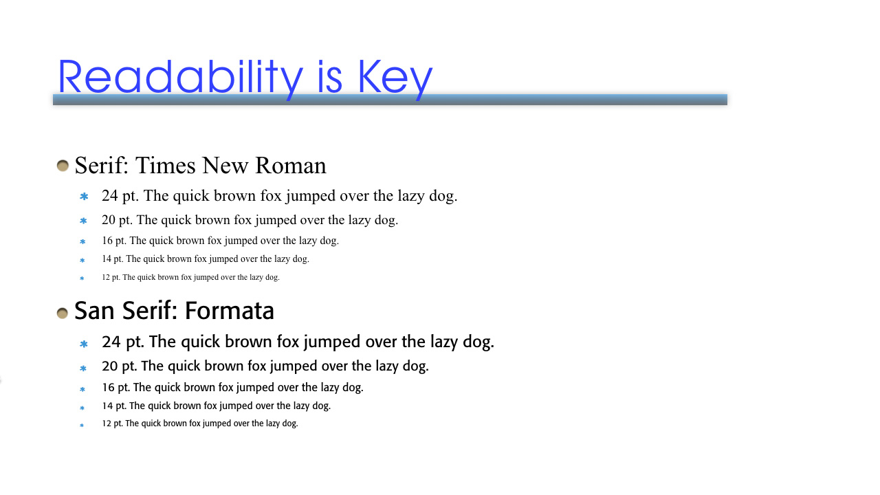 (Click to see a larger version of this image.)
Here’s what I mean by readability. Notice how you can read sans serif fonts more easily at smaller point sizes than serif fonts. When it comes to video, this readability makes a big difference.
EMOTIONS OF FONTS
Talking about the “emotions” of fonts is a lot like talking about the emotions of color – there is a lot of room for interpretation. Still, there are basic emotions that apply to each of these four groups.

Emotions that we associate with Serif fonts include:
Typefaces in this category include:
There are many others, which you can spot easily browsing through a font menu
Personally, I don’t recommend Times New Roman. Like Helvetica, it is over-used and very hard to read at smaller point sizes. Trajan is nice, but only exists as all caps.

Emotions that we associate with Sans Serif fonts include:
Typefaces include:

Emotions that we associate with Script fonts include:
Typefaces include:

Emotions that we associate with Specialty fonts range widely because there are so many different designs to choose from. These should be used in large point sizes only, and limited to main titles.
Typefaces include:
USING FONTS
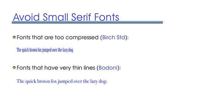
Keep in mind that video, when compared to print, is low resolution. A half-page high quality magazine ad is roughly 56 megapixels. An HD video image is about 2 megapixels. There isn’t a lot there. This means that ornate typefaces will not look as good in video as they do in print. Additionally, because text in video is only up for a few seconds, legibility is critically important.
Text in media needs to be selected both for its emotional content and its ability to be read quickly.
Here are some ideas to consider when choosing a font:
If you are animating text, bring the text in from the right edge. In most western countries, we read text from left to right. By animating from right to left, you give the audience an extra second or two to read the text before it disappears.
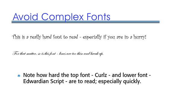
Another cool psychological tip is that things seem easier to do when the instructions are easier to read.
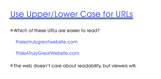
Some producers are trigger-happy, they want text on screen as briefly as possible. But, think about this for a minute, we use text to tell the audience something that they can’t learn any other way – like the location of a shot or the name of a guest.
There is no value to the audience in having text flash on and off screen so quickly they can’t read it. You’ve been staring at this title for weeks, they only get a few seconds, give them a chance to actually READ it!
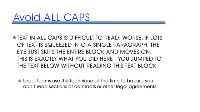
See, you just skipped over this text. Why? Because it is in all caps. No one reads text in all caps. Be very, VERY careful putting any text you want the audience to read in all caps.
SUMMARY
Typeface design is a fascinating subject. With so many fonts to choose from, and each one carrying its own emotional values, both you and your audience will benefit by expanding your font horizons and experimenting with something new for your next project.
3 Responses to Pick Fonts for Emotion and Power
6-8 seconds is a decent interval to put up a standard lower-third.
My own rule of thumb is; however long it takes you to read it through, twice, at a normal reading speed.
How’s that different? The complexity of the lower third is variable, depending on the content: it could have a strange, technical, or foreign word in it, or a more complicated official title, or a subscript, like they have on the cable news channels. Account for any cutesy fly-in/fly-out moves and little animations and whatnot, and for breaking your attention away from the main action, and you could maybe go over eight seconds sometimes.
And sometimes, we hold a lower third a tad longer for a psychological reason, like when you want to reinforce the technical credentials of the person talking, or establish authority and impress the audience with the person’s rank.
Some of the smaller fonts and the serif ones can be made a little easier to read by adding edge borders and drop shadows, or at least layering a higher-contrast background bar behind them. In analog days, this was vital if your material had to go thru multiple generations of transfers and dubs because you’d quickly lose fine detail. Minuscule Legal Disclaimer copy was especially hard to keep clean and readable. These days there are specific tools and specs for making disclaimer text, to help meet legal requirements.
And still, nobody reads them.
Choosing fonts for teleprompter copy can be counter-intuitive. Some stations have a long-established tradition of using all-caps for rolling prompter copy; it goes back to the very early days of prompters that used rolls of paper on a conveyor or rollers, and the machine that typed on the paper rolls was limited to all-caps. But all-caps is actually poor for prompter readability, because we decode words we read by the *shape” of the letters and words in mixed-case. You can test this yourself, by looking at gaussian-blurred versions of the same word in all-caps and in mixed-case. The mixed-case version remains decipherable, well past the point where the all-caps version is unrecognizable.
When an inexperienced reader reads a prompter speech in all-caps, they actually have to take their visual impression of each all-caps word thru an additional decoding step, to get to the word shape associated with the thing connected to that word. It’s only a microsecond more, but it does add some “processing overhead” to a reader’s on-the-fly comprehension, and results in either a slowdown in delivery, or an inexplicably tense reader giving a less-polished delivery, because part of the brain is too busy subconsciously decoding the font, to spend more resources giving the best interpretation of the material.
Newspapers choose serif-containing fonts because they believe it enhances readability thru enhancement of the individual letter shapes.
Mark:
Great comments, thanks! And I remember those first prompters with rolling paper. We typed them using the Orator typeface.
ALL CAPS is very hard to read – in print, on screen, or on prompter.
Larry
Thanks for this great article, Larry!
I didn’t decode why I choose a certain font for any particular film, now I won’t be able to NOT think about the emotion, etc.
I have noticed that Woody Allen uses the same font and white on black style for all of his movies. That sort of separates the title from the story. No emotion included.