
 This week’s article was spurred by a Ted Talk on Typefaces delivered by Matthew Carter, a legendary typeface designer that I had the pleasure of working with in the mid-1980’s when we both worked at Bitstream in Boston.
NOTE: Here’s the link to Matthew’s Ted Talk.
It was from Matthew all those years ago that I developed my love of using the right font for the task, which has carried over into my video work. By the way, Norbert Florendo has a great definition of the difference between “font” and “typeface:” A “font is what you use, and typeface is what you see.”
Think of a font as a song, with the typeface being the MP3 version of that song. (Though, truthfully, since the Mac calls just about everything a font. I’ll be using the two terms interchangeably during this article.)
WRITING ABOUT FONTS IN YEARS PAST – A QUICK HISTORY
I’ve written a lot about fonts and typefaces over the years. Back in 2004, I wrote an article called “Guidelines for Great Text in Final Cut Pro HD.”
Then, in 2006, I enlarged that first article into: “Improve the Look of Your Images and Text.” I updated that document for the next five years; it became one of my most popular articles.
FONTS ARE COOL
Fonts have a personality, an energy, an emotion that can enhance, contrast with, or conflict with your project. The more you know about fonts, the better you can use them to express what your project is about.
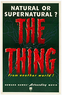
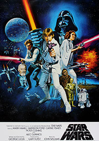
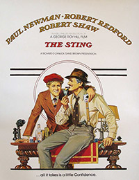
Need proof? Here are three classic examples:
THE PRESENT
Standard high-quality print (for example, magazines) still provides higher resolution than a Retina Display monitor. That doesn’t mean that your computer monitor is bad, just that print is better. Also, unlike print, video images move. Either the text is moving or the background behind the text is moving. In either case, a moving image is harder to read than a still image.
Text always looks better on your computer screen than it does on a TV set or after compression for the web. So, if you can’t easily read your text inside your editing system, your viewers won’t be able to read it either.
Compounding the problem is that, in today’s attention-deficit-disordered world, many producers are afraid to hold text on the screen longer than a nanosecond. This means that you need to pick fonts which are INSTANTLY readable. Keep in mind that, while you may have stared at that text countless times, the audience is seeing it for the first time and with barely enough time to read it.
For all these reasons, I’ve updated my suggestions on how to use text in film and video.
LARRY’S TEN RULES FOR USING TEXT IN VIDEO
Bonus 11. Don’t use text rolls for closing credits in video, especially with interlaced footage. Rolls ALWAYS look bad. Use full-screen titles that don’t move.
SOME EXAMPLES
Having rules is helpful, but let’s see some examples putting them into practice. (These examples were made using Final Cut Pro X, but they would look exactly the same in Premiere, FCP 7, or any other non-linear editor.)
Rule 1: Readability

Compare how quickly you can read the Gill Sans at the top, compared to Giddyup at the bottom. Now imagine that the text was only up for five seconds. Which would the audience read more quickly?

In general, use fonts where all lines in the font are evenly thick and avoid serifs (the little “feet” at the edges of a character). From left to right: Century Gothic, Hobo, and Optima.
Rule 2: Add a Drop Shadow
Notice how your eye immediately jumps to the bottom version of Herculaneum because the drop shadow makes it easier to read.
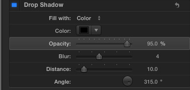
Here are the drop shadow settings I recommend. (I use similar numbers in Premiere and FCP 7, as well.)
Rule 4: Horizontal vs. Vertical Text
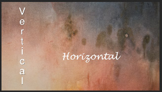
Notice how your eye went first to the horizontal text and totally ignored the vertical text? Even though the horizontal text is smaller and harder to read than the vertical text (The vertical text is Helvetica with a drop shadow, while the horizontal text is Lucida Handwriting, with no drop shadow and sized ten points smaller than the vertical text.)
Rule 5: Don’t Make Type Too Small
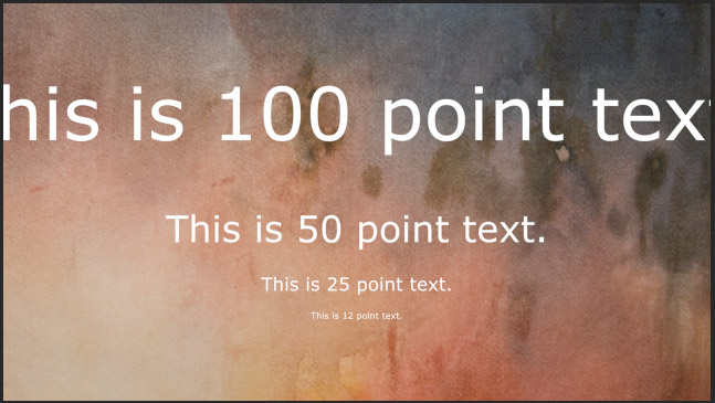
We use text to explain stuff to the audience. Don’t make your text so small that people can’t read it. Stylish is good. Readability is better. Here are four different sizes of Verdana.
Rule 6: Avoid Thin Serifs and Bars

All three of these “W’s” are 75 points and in all cases, the thin lines, excessive ornamentation or serifs are tearing out. You also see excessive stair-stepping in the bars. From left to right: Onyx, Jazz, Bordeaux.
Rule 7: Avoid Fonts with Highly Curved Elements

Notice how all the fine lines are tearing out. Again, each letter is 75 points. From left to right: Mona Lisa Solid, Snell Roundhand, and Cloister Black.
The more complex the font, the more likely you are to have problems displaying it in smaller point sizes. If you MUST use a complex font, make it as big as possible.
Rule 8: Avoid over-saturated or too-white colors
Don’t over-saturate font colors. Keep color saturation inside all bounding boxes and keep white levels equal to, or less than, 100%.
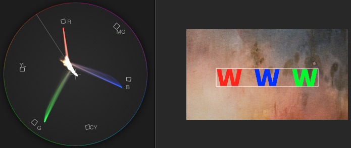
Rule 9: Keep Text Inside Safe Zones
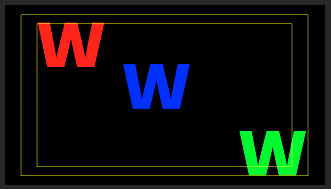
When compositing text for broadcast or cable, keep all text inside Title Safe, indicated by the inside yellow rectangle. When compositing text for the web or computer playback, keep all text inside Action Safe, indicated by the outer yellow rectangle. Text placed all the way to an edge feels very uncomfortable.
In this example, the red “W” is inside Title Safe, while the green “W” is inside Action Safe but NOT inside Title Safe.
Rule 10: Make Sure Text Contrasts with the Background
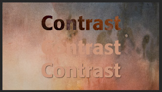
Where does your eye go first? The top word. Why? Because it contrasts so clearly with the background. This is Formata (a favorite of mine) at 125 points. The top image has a Difference blend mode applied. The middle image uses the same color as the background. The bottom image is a copy of the middle image, with a drop shadow applied.
See how the drop shadow helps, even when the font color matches the background?
SUMMARY
Just like people, fonts have different personalities that you can use to reinforce the story you are telling. Personality is great – but your audience still needs to read and understand your words. These suggested guidelines will help you make your text look great.

2,000 Video Training Titles
Edit smarter with Larry Jordan. Available in our store.
Access over 2,000 on-demand video editing courses. Become a member of our Video Training Library today!
Subscribe to Larry's FREE weekly newsletter and
save 10%
on your first purchase.
7 Responses to Tips to Make Your Text Look GREAT!
Your last illustration on contrast brings up one more point about a mistake I often see happen. Relative “brightness” alone does not ensure best contrast. It’s a good practice to double-check your text from time to time, using a monochrome setting on your monitor. Part of why the word “contrast” in that demo image is so hard to see, is that the color “value” of the center text is too similar to the average value of the background. I always check my text in B&W to see if the text really”pops”, even for color-blind viewers.
They knew about this in the old B&W days: if you look at color stills taken behind the scenes on 1930’s serials like Flash Gordon, and even color stills or film of the Tropicana Club Set in early TV shows like I Love Lucy, the colors of the costumes and sets look like some kind of acid trip in terms of color usage. They were picking colors that were on opposite sides of the color wheel, even if it meant the macho hero costume in Flash Gordon would actually look Pepto-Bismol pink. They did it that way to make the relative VALUES read properly to generate contrast in grayscale/ black and white. The wrong values of, say, red and green, create type you can barely discern from background.
Mark:
This is an excellent point. We want contrast in BOTH color and gray scale values to make our text stand out.
Thanks,
Larry
Larry,
I’m doing a doc with lots of foreign speaking text which all requires subtitles. All the interviews were shot 2 camera and are going to be multiclipped. So the question is what is the best way to add subtitle text and cut as a multiclip?
Seth
Seth:
Do this in two steps:
* Edit the multicam clip
* After the editing is complete, add the subtitles.
Larry
Larry, my apologies for the ambiguity of the above note. I thought this was a FCP X article. So, the question above really is about developing a strategy for how to use subtitles with multiclips.
Seth
Found that color “Lucy” footage… check out the club’s color scheme in real life, and notice how well it reads in B&W
http://metvnetwork.com/share/behind-the-scenes-footage-of-i-love-lucy
Amazing tip! Woah!, Love the font of writing in this leave a reply section! So nice and typewriter-like, LOVE IT SO MUCH!