
![]() Here is a collection of ten fun facts about Titles in Final Cut Pro X that you may not know. I discovered in writing this article that the subject was much more complex than I first thought. So I expanded this to include text, backgrounds, and animation, in addition to titles.
Here is a collection of ten fun facts about Titles in Final Cut Pro X that you may not know. I discovered in writing this article that the subject was much more complex than I first thought. So I expanded this to include text, backgrounds, and animation, in addition to titles.
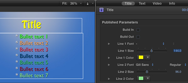
There are four tabs at the top of the Inspector when a Title is selected in the Timeline: Title, Text, Video, and Info.

Most of the time, you’ll animate a title using the Title tab and style the text using Text.
TEXT IN HIGH-DEFINITION LOOKS BETTER THAN TEXT IN STANDARD-DEFINITION
The problem with standard definition is there are not a lot of pixels in each image. This means that you need to keep text sizes larger, fatter, and very clean. No serifs, no scripts, no thin letters.
Here’s an article I wrote a while ago that goes into this in detail. I wrote this for FCP 7, but it still applies to FCP X.
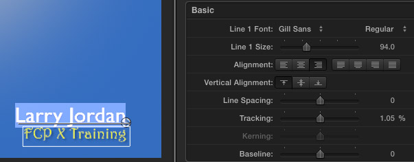
CREATE A TEXT GRAPHIC
Need to create a screen full of text? Many of the text formats only allow the title in the upper half, with text in the lower half of the title.
But, if you select Fade, you can position the Title anywhere on the screen – either by dragging or changing the vertical alignment button in the Text tab.
Then, add as much body text as you can fit on the screen by typing it in the text entry box in the Text tab, rather than on the screen. You can style the text using the settings farther down in the Text tab.
To turn off the Fade animation behavior be sure that Build In and Build Out are unchecked in the Title tab.
CREATE A BACKGROUND GRAPHIC
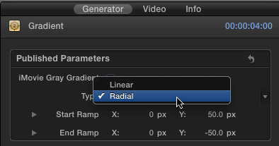
The blue background in the screen shot above uses the gradient generator with the Type set to Radial.
MORE BETTER BACKGROUNDS
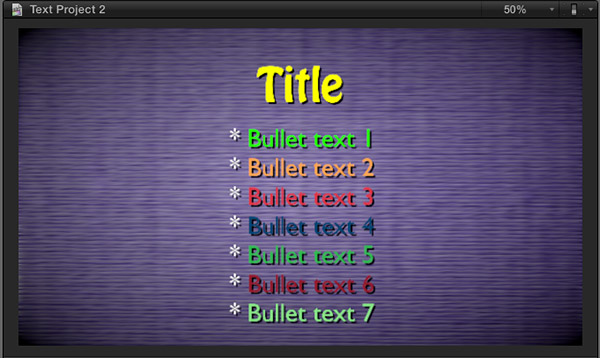
However, a much more flexible background choice for text is Fabric. Especially when you combine it with a few other filters.
This is Fabric > Sisal 1 with:
Notice how different text colors with the same drop shadow are easier, or harder, to read.
BETTER SPORTS STATS
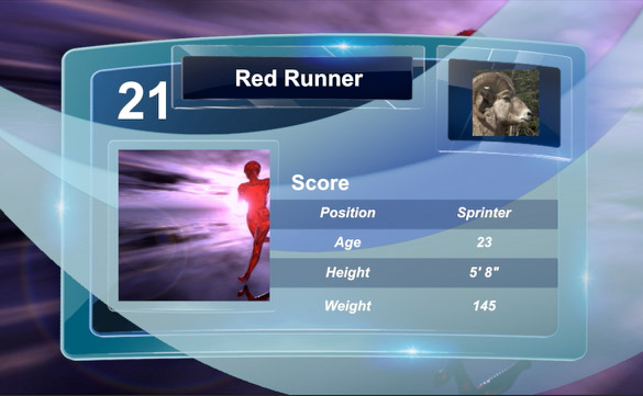
You may have discovered the Stats title. Here are some other ideas to try:
STARTING CLIPS IN THE MIDDLE
Drop zones always play video clips from the start of the clip. To have the clip start somewhere other than the beginning, create a compound clip and edit the video into it so that the clip starts when you want.
Then, add that compound clip to the drop zone.
NOTE: Be sure to render this effect before trying to play it.
PREVENTING UGLY TEXT
It was driving me nuts. I love good type design and every time I changed the font in FCP X it looked AWFUL! I was really depressed. Surely the text in all these titles wasn’t that bad?
It wasn’t.
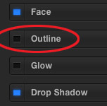
If you are getting ugly text: thin, blocky, rough edges… select the text and turn OFF the Outline option in the Text tab. When the outline is gone, the text looks great!
Whew!
SOMETHING THAT DOESN’T MOVE – YET
Many of the titles in FCP X are animated. Which is nice, if you want your text to move. But, what if you want it to stand still?
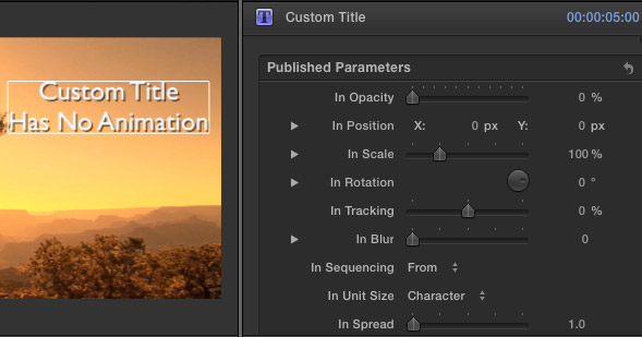
That’s where the Custom title comes in. By default, the Custom title is a full-screen title with no default animation.
However, there is a wide variety of animation controls associated with this title:
By now you should start to see a trend. By default, this title doesn’t move. However, it provides plenty of animation when you need to get things moving.
STOP SOMETHING FROM MOVING
Is there a title you like, but you don’t like the movement? Easy to fix.
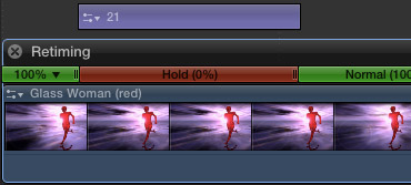
For example, in this screen shot, the title will animate on, but remain stationary at the end of the clip. This would be a typical use when you want to have a title end as you cut from one shot to another.
MAKE THE BASIC LOWER THIRD A BIT LESS BASIC
You may have noticed that the basic lower third just aligns to the left edge of the screen. You may also have noticed that it seems to want to stay there, because there is no alignment button to center the lower third, or align it right. Worse, even if you realign it, the text chops off on the left side.
Sigh… The Basic Lower Third title is not your friend.
What to do? Use a different lower-third: Middle.
By default, Middle aligns text center. If you need to align the text left or right:
It isn’t the ideal way to position text, but it works a whole lot better than the Basic Lower Third and the quality is perfectly fine.
WANT SOMETHING DIFFERENT? CREATE IT IN MOTION 5
Want to create something completely different?
Fire up Motion 5 and create your own title effect. Be sure to select the FCP X Title option in the Welcome screen. As soon as you save the Motion project, it shows up in the Title Browser in FCP X.
Nothing like Motion to unleash your creativity.
Need some help getting started with Motion? Here’s a recent video tutorial that can help.

2,000 Video Training Titles
Edit smarter with Larry Jordan. Available in our store.
Access over 2,000 on-demand video editing courses. Become a member of our Video Training Library today!
Subscribe to Larry's FREE weekly newsletter and
save 10%
on your first purchase.
41 Responses to FCP X: Fun with Titles
Newer Comments →-
 sheli says:
August 16, 2013 at 4:55 am
-
 Bob says:
January 15, 2014 at 12:29 pm
-
 Larry Jordan says:
January 16, 2014 at 1:51 pm
-
 Roger Main says:
February 27, 2014 at 1:28 pm
-
 Adam Reece says:
April 8, 2014 at 8:59 pm
-
 Larry Jordan says:
April 8, 2014 at 11:01 pm
-
 Cat Martino says:
September 2, 2014 at 4:03 pm
-
 LarryJ says:
September 2, 2014 at 4:19 pm
-
 Cat Martino says:
September 2, 2014 at 4:43 pm
-
 LarryJ says:
September 2, 2014 at 4:47 pm
-
 Cat Martino says:
September 2, 2014 at 4:45 pm
-
 Cat Martino says:
September 2, 2014 at 4:53 pm
-
 Paul McCabe says:
September 23, 2014 at 2:29 pm
-
 LarryJ says:
September 23, 2014 at 2:49 pm
-
 Paul McCabe says:
September 23, 2014 at 2:56 pm
Newer Comments →I would like to know exactly what fonts are available on FC Pro X because I am using iMovie and it is useless and has very little fonts options.
How can I save FCPX lower thirds settings, (font, line size, bar width), so I don’t have to re-do them every time I make another lower third?
Bob:
Use the Style drop-down menu at the very top of the Text panel in FCP X. It’s the one that has the word “Normal” on it.
Larry
How can I publish on-screen controls?
Is there a way to add additional text boxes within a title? I’d like to basically design my own very simple closing credits screen, but I’m limited to template options that include enough existing text boxes to suit my purposes. It would be far easier if I could select a very basic existing template and add and move text boxes as necessary.
Adam:
The best way to do this is using Motion. This gives you far more text formatting and animation controls than FCP X.
Larry
Hi there!
I have been working round the clock on a video I am psyched about. Only thing… I used the default comic book looking font with the “Bug” and “Fade” text add ons. I am really bummed right now bc I just went to finalize the video, but for some reason, every place I have used the text changed to Helvetica – and I am searching high and low to figure out how to change it back to the cool all capitols comic book looking font, but I don’t know what it was. Even in the boarder at the side, when I put the cursor over it, it is helvitica now. Maybe I mistakenly did a system change, but I do not remember when.
Please helP:).
Thanks!
Cat
Cat:
The only reason this would happen is that if you use a font in a project that is not installed on the computer playing it back.
Double-check that the font is properly installed.
Larry
Thanks Larry!
It’s very strange, because it is the stock font that came with FCPX when one uses “comic book” (bug or fade). I never installed any additional fonts…
I see that the same font is still there in the right panel, but when I graze over it, it changes to being helvetica again.
Do you know what that font is called? perhaps I can manually change it back, if I knew what it was?
Cat:
Without seeing it, I can’t be sure – but you might check Comic Sans.
Larry
I can also invite you to a private ruff of the video (it’s in the 1st 3 seconds) – to see what it was.
It’s so frustrating, I had just fixed all the sound and was going to finalize the project to release tomorrow, finally:).
Thanks, I had already checked out your other tutorial:). But it’s unfortunately not helping this particular issue…
The stock with comic book (fade) on FCP was unfortunately not comic book sans. I tried that… Would you be able to open up you FCP and see what that font is called? It’s all capitols and in some sort of italics and comic book looking.
I can also invite you to this earlier video ruff via email or send you a dropbox link…
Thank you so much! This is so frustrating as I’ve been working non-stop on this for weeks and finally ready to finish:).
Hi there, is there a facility within FCPX to do slow writing titles, a slight variation of typewriter style, where the letters/words appear on screen slowly at a controlled speed. I’m doing a project at the moment that includes diary entries and would like the words to appear as they are spoken. Hope you can help. Thank you.
Paul:
Yup – the animation settings in the Custom title clip.
Larry
Thanks a lot Larry, your very kind.
Much appreciated.
P