
NOTE: While I’m using screen shots from Final Cut Pro X, the settings described in this article apply to any editing software. If you are using FCP 7, the interface to the 3-way Color Corrector filter will look a little different, but the results in your images will be the same.
This article grew out of several requests from readers for a before/after comparison of color correction. In this article, I want to talk about what happens when you make a color or exposure adjustment. One of the hardest challenges as you get started doing your own correction is training your eye to actually see what it needs to see.
NOTE: I am a huge fan of the books by Alexis Van Hurkman, from whom many of these ideas derive. He writes about color grading and color correction in such a way as to bring them to life – which can be a trick when talking in print about how video looks on a screen.
As Alexis has written in the forthcoming FCP X: Advanced Editing published by Peachpit Press, there are four goals in color correction:
To achieve those goals there are three settings we can adjust:
Within those three settings, we can adjust:
It is well beyond the scope of a single article to teach the process of color correction, so what I want to do is provide some side-by-side comparisons to illustrate what you are adjusting as you modify these levels.
NOTE: I use the term “in general” a lot in this article. That’s because rules about color were made to be broken. However, in most situations, you will make your pictures look better by following these suggestions.
USING SCOPES
There are four scopes that we use all the time in looking at video:
Of the four, the most useful is the Waveform monitor, which shows gray-scale values, and the Vectorscope, which shows color values. (If you are interested in learning more about how to read scopes, see the ADDITIONAL RESOURCES section at the end of this article.)
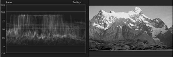
When we use the Waveform Monitor to view an image, all color is ignored — the scope just examines the gray-scale values of the image; which is what I am illustrating here with the black-and-white photo. When we color correct a clip, the first thing we adjust is the gray scale, which is also called “exposure” or “contrast.” You can’t get colors to look right if the grayscale values are wrong.
In general, the darkest portions of an image should just touch the 0 (or “black”) line at the bottom, while the brightest portions of an image should stop just below the 100 (or “white”) line at the top.
EXPOSURE
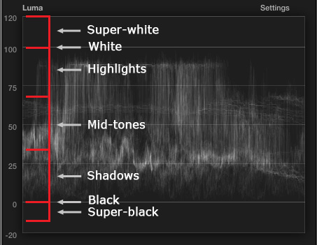
The waveform monitor is divided into seven different regions, each corresponding to a different level of brightness, as the screen shot above illustrates. Exposure affects the gray-scale values of an image, how light or dark it is. Keep in mind that adjustments to color and exposure are supposed to be subtle. They should “enhance,” and not “bludgeon.”
We can change the look of our image, depending upon which region we adjust:
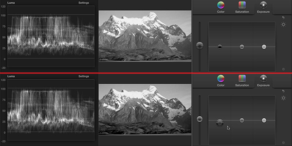
Here are some before (top) and after (bottom) pictures that illustrate this.
There are three panels in the Color Board:
Each section of the color board has four sliders, called “pucks,” from left to right these are:
Here, for instance, I am lowering the shadows to make the darker shadow portions of the image darker and richer. Notice the difference around the base of the mountain. In general, you want the darkest part of the image to sit right at the zero line of the Waveform monitor, and not go below it.
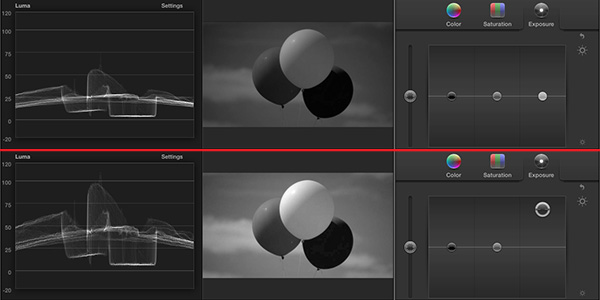
In this example, I am raising the highlights to brighten the image. Look how the balloons have far more energy or “pop” as they get brighter.
It is generally considered a “really good idea” to make sure white levels don’t exceed 100.
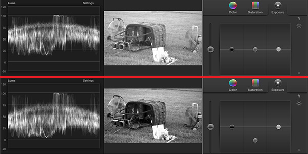
Or, we can change the time of day from mid-afternoon to a romantic early evening by adjusting the mid-tones. In this case, I am moving them lower to darken the middle-range images.
In all these cases, we only adjusted gray-scale values, in fact, we didn’t even look at the color. In general, you should always adjust gray-scale values first, then adjust color. Also, I rarely recommend using the Global slider for exposure, as it changes all values by the same amount. Most of the time, you may need to adjust shadows or highlights, but almost always by different amounts.
SATURATION
Saturation is probably the control you are most familiar with. Saturation is the amount of color in a scene. Unlike exposure, we tend to adjust saturation globally.
Because the Waveform Monitor only shows the gray-scale values of an image, we need to switch scopes to the Vectorscope.
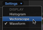
To do that, choose Vectorscope from the Settings menu in the top right corner of the scopes.
With the Vectorscope, Saturation is represented by distance out from the center. When a color is represented by a dot at the center of the Vectorscope, this means that it is a shade of gray, with no color. The farther out a pixel moves from the center, the more color that particular pixel has. We say we are increasing it’s saturation.
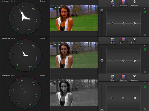
Here, I’ve taken the same image and adjusted saturation. The top image is excessively saturated, the middle image has normal saturation, and the bottom image has all color saturation removed.
Notice the difference in the Vectorscope display. Normally, saturation changes are not this massive, instead you would adjust the setting until colors look rich, but not dripping with color. While you may think boosting saturation is a good thing, most of the time moderation is called for. You don’t ever want saturation to be so high that the Vectorscope traces exceed the outer circle.
Generally, you adjust saturation until an image looks “right.” What “right” means depends upon whether you are telling a crime story or recreating an MGM musical.
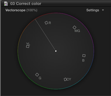
COLOR or CHROMA
Unlike Saturation, Color refers to the hue of an image. The letters around the edges, are called “targets.” The shade represented by the Vectorscope moves as you move around the circle. For instance, moving in a clockwise direction starting at the top left, the targets are Red, Magenta, Blue, Cyan, Green, Yellow, and back to Red.
So, a color that is bright red would be located close to the red target in the upper left.
To help us get our colors right there’s a magic line that can help a lot. It’s called the “Skin Tone Line.” You see it in the screen shot above as the diagonal line going up to the left.
Regardless which race or ethnic group our actors are a part of, all of us have the same red blood under our skins. This line represents the color of red blood under skin. In general, when you want to make skin tones look normal and believable, you want them within a couple of degrees of this line. Above the line leans ruddy, below the line leans sallow.
Keep in mind that in most videos, we are NOT trying to make our actors look like they do in real life, we are trying to make them look consistent and “normal.” If directors wanted people to look like “real-life, no one would need to wear makeup!
The process of how and why to adjust colors could – and does – fill books. However, here’s a quick peek.
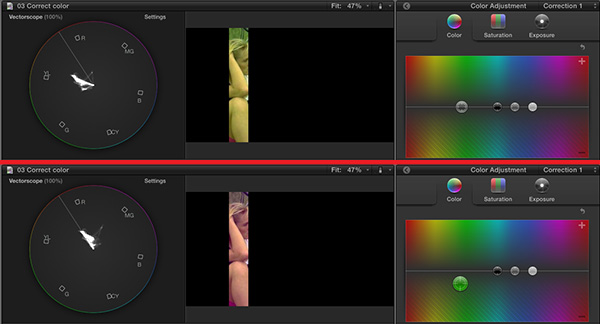
Here’s a closeup of a bicycle rider’s skin. Notice how strongly yellow this is in the top image? Her skin SHOULD be on the Skin Tone Line in the Vectorscope, but it isn’t. Its way below it, close to the yellow target.
To fix that, I’ll move the Global color slider down (which removes color – moving it up ADDs specific colors) and on top of the yellow section (which specifically removes yellow colors). I keep adjusting the slider until the skin tone is properly set on the skin tone line.
Color is a never-ending and fascinating subject. We have barely skimmed the surface here. But, now, you have a better idea of what to look for and what these controls adjust.
ADDITIONAL RESOURCES
Here’s an article on how to read video scopes
FCP 7: How to Read Scopes
Here’s an article on how to do a quick color correction in FCP X.
FCP X: Quick Color Correction
Here’s an article on how to do a quick color correction in FCP 7.
FCP 7: A Fast, Easy Method of Color Correction
Here’s a webinar on how to color correct in FCP 7.
Color Correct Using Video Scopes in Final Cut Pro 7
Here’s a video training on how to manually color correct in FCP X.
Manual Color Correction in Final Cut Pro X
/store/064-fcp-x-multicam-editing/

2,000 Video Training Titles
Edit smarter with Larry Jordan. Available in our store.
Access over 2,000 on-demand video editing courses. Become a member of our Video Training Library today!
Subscribe to Larry's FREE weekly newsletter and
save 10%
on your first purchase.
10 Responses to FCP X: Intro to Color Correction
Hi
Thanks Larry … nice intro. Very clear.
But everyone is still ignoring/dodging the fact that trying to do matching/creative adjustments from shot to shot in FCPX without being able to see more than one image is crippling IMO.
Sometimes, colors in a shot even need to gradually change during the shot … to ease into the next image.
That’s really hard right now.
Lee:
I agree – I also miss Control+Up/Down arrows, which allow faster comparisons. However, the purpose of this article was not to teach color correction techniques, but to explain what the different settings do. And, in that case, it doesn’t make any difference which software you are using, because lowering shadow (black) levels creates the same results whether you are using FCP X, FCP 7, Avid, Adobe…
In other words, I felt there was a need for a somewhat agnostic primmer.
Larry
Larry,
This is a good teachable lesson. I appreciate it.
Phil:
Thanks, that was EXACTLY the idea I had in mind when I wrote it.
Larry
[…] larryjordan.biz Share Tweet FCPX, Final Cut Pro X, Ларри Джордан, Обучение, […]
Larry,
Could you do another article explaining your last point further regarding Color adjustments? With the color wheel it was much easier to see what color to take away because it was on the opposite side of the color wheel. I have a much harder time establishing whether to add or take away color on the Color Board. Is there a trick to doing this?
Larry,
This is truly a fantastic introduction.
You are an excellent teacher.
Much appreciation.
Thank You
Great article, and I have just bought the class you gave on CreativeLive =)
But, when you speak of waveform I see that I have the range measure in volts, not IRE. I live in a PAL land.
How should I view my monitor as 0 and 100% ?
And at what values would it be reasonable to put the mid tones?
Regards,
Daniel
Hi larry, great stuff, big fan of ur work, I have a question regardinn fcpx, is it possible to edit in color and in black and white on the same clip, e.g one person in colour annd the other in b&w? If so how do I get round this? Thanks a lot
Bashir
Bashir:
Final Cut does not care about the color of the pixels in your shot, so the answer is yes.
However, your question MIGHT be: how do I create this effect. To do it in FCP, you would need to shoot one of the two people in front of a green screen.
If they are already shot, you’ll need to do rotoscoping – which takes a long time and is very precise. After Effects would be the best tool for that.
Larry