 [ I am deeply indebted to long conversations with Alexis Van Hurkman for many of the ideas expressed here, as well as his excellent book: The Encyclopedia of Color Correction. ]
If you ask a colorist what they do to make actors look good on screen, they’ll tell you that they just watch the monitor and make them look “right” for the scene. While truthful, that advice doesn’t help the rest of us that don’t have their experience at seeing and adjusting color.
The purpose of this article is to give you some guidelines you can use to fix color problems to help your actors look “normal.” While every actor looks a bit different, if you have a color problem, these guidelines will help you fix it.
Just as actors wear makeup to look good on camera, we can use these guidelines to help our actors look as good as possible in post. Whether you use Apple Final Cut Pro X, Final Cut Pro 7, Adobe Premiere Pro CC, Premiere CS6, or other video editing software, these guidelines apply.
NOTE: Color grading is the process of giving a scene a specific “look.” Color correction is the process of fixing a color problem.
BACKGROUND
Color correcting human skin adjusts two elements:
Gray-scale values are indicated on the Waveform Monitor. Tweaking gray-scale values adjusts the exposure, giving the image richness and energy.
Color values are indicated on the Vectorscope. Tweaking the color values adjusts the shade and amount of color – called “hue” and “saturation” – in the image.
Generally, for consistent results, we adjust gray-scale values first, then color values.
VIDEO SCOPES
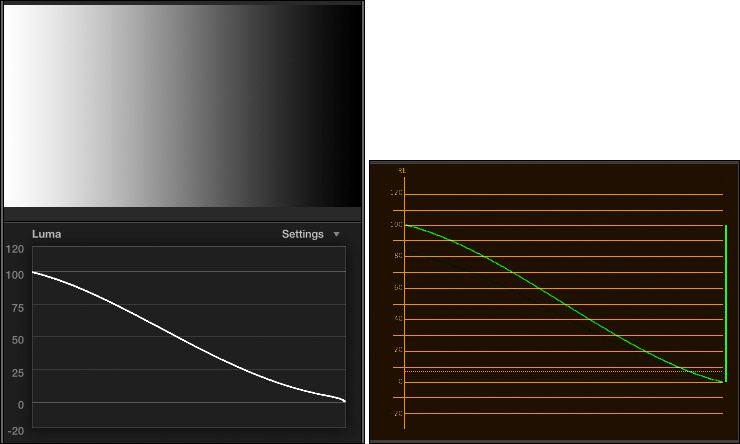
The Waveform Monitor tells us everything we need to know about the gray-scale of an image, but nothing about color. The left image is the Waveform Monitor in Final Cut Pro X, the right is the same image, using the Waveform Monitor in Premiere Pro CC. While both scopes look a bit different, they both measure the same things: image gray scale values. (The scopes in Premiere Pro CS6 look the same as Premiere Pro CC.)
On the Waveform Monitor, white is up, black is down and gray is in the middle. Moving from left to right in the image corresponds to moving left to right in the scope.
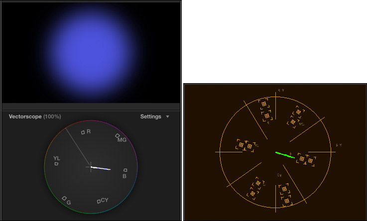
The Vectorscope tells us everything we need to know about the color of an image, but nothing about gray-scale. Again, the left image is from FCP X, while the right is the same image in Premiere Pro CC.
We use both these scopes to make informed decisions about color.
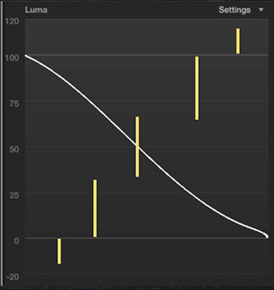
The Waveform Monitor measures gray-scale values as percentages of white, where “pure” white is 100%. The scope divides grays into seven regions:
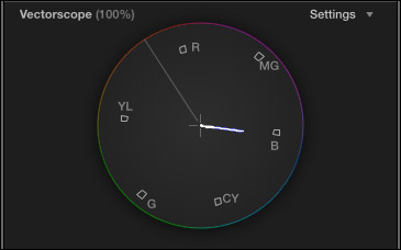
The Vectorscope measures two color values:
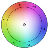
The six small boxes represent the three primary and three secondary colors, starting with red (near the top), then rotating clockwise to magenta, blue, cyan, green, yellow, and back to red. Here, for example, the scope illustrates a single hue (or shade) of blue, with a variety of saturations. (Red, green and blue are primary colors, while magenta, cyan, and yellow are secondary colors.)
See that line going up-left, about 10:30? That’s called the “skin-tone line.” Skin is actually gray. (You, ah, know this by checking out your dead skin in the bathroom when no one is looking.) What gives skin its color is the red blood circulating underneath. Because all of us have the same color red blood, the skin tone line represents the color of red blood under skin. The skin tone line is a very, very powerful color indicator, as you’ll see in a bit.
WHEN THINGS ARE EASY
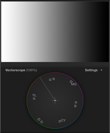
The key rule in color correction is: “If something is supposed to be gray, it should form a single dot in the center of the Vectorscope.” (Gray is composed of equal amounts of red, green and blue. Black, white, and gray are all “gray” to a Vectorscope.)
So, when life is easy, if there’s a color problem, you find something gray in the shot, isolate it with a crop and adjust the colors until the Vectorscope shows a single dot.
Easy.
Except, both you and I know “easy” never happens on a deadline.
WHEN THERE ARE NO PEOPLE IN THE SHOT

When there is no gray in the shot and there are no people in the shot, we have a lot of latitude, because no one really knows the exact colors of that mountain or barn. So we can adjust the exposure and colors however we want.
WHEN THERE ARE PEOPLE IN THE SHOT

But, where there are people in the shot, life is much more complex; because skin tone is a “memory color.” We ALL know what skin tone is supposed to look like. The problem is, how do we get there?
That’s where these guidelines come in. If all you have is a shot with messed up color and no reference grays, use the scopes and the numbers below to get you back on track.
The first thing you need to remember when color correcting is that there are no “white” people and there are no “black” people; there are only “mid-tone gray” people. Caucasian skin is about 70% of white, while black skin is about 20% of white. Neither is pure white or pure black.
The guidelines below make three assumptions:
CAUCASIAN SKIN
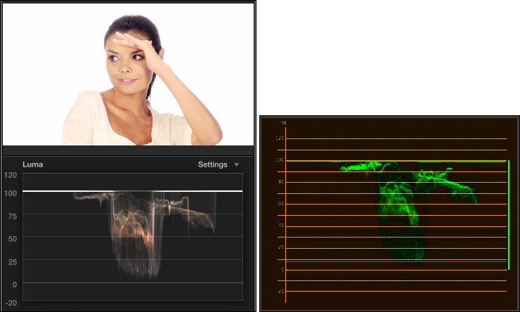
Adjust gray-scale (exposure) settings so that female caucasian skin places maximum highlights between 50 – 75% on the Waveform Monitor. In this example, her skin ranges from 50% to just under 80%, the extra highlight is caused by the edge of her hand.
Set the maximum highlights for male caucasian skin a bit darker: 45 – 65%.
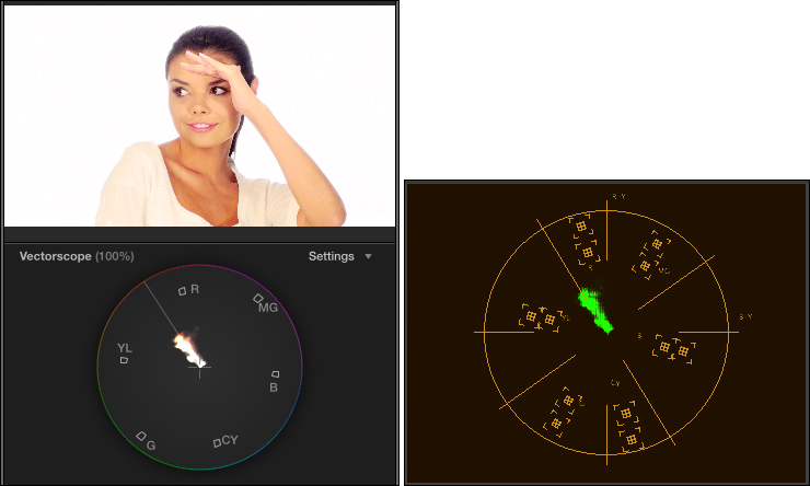
Adjust color (hue and saturation) settings so that female caucasian skin is about 40% saturated and located directly on the skin tone line or no more than 2° above it. Here, she is directly on the line with the proper amount of saturation.
Male caucasian skin is a bit less saturated: 35%, and also located directly on the skin tone line, or up to 2° above it.
HISPANIC AND ASIAN SKIN
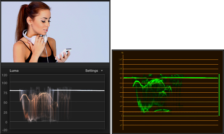
Adjust gray-scale (exposure) settings so that male or female hispanic skin puts maximum highlights between 35 – 55% on the Waveform Monitor. Here, she has the right gray-scale values, but her white headsets make the scope read a bit brighter. When trying to set a level, crop into a well lit portion of the skin so you can see the values on the scope more accurately.
Asian skin uses the same gray-scale values.
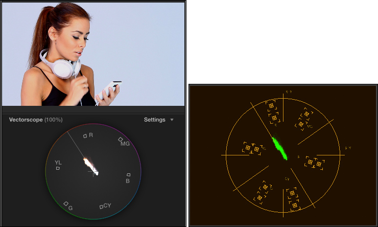
Adjust color (hue and saturation) settings so that male or female hispanic skin is about 30 – 35% saturated and located directly on the skin tone line, or no more than 2° above it. Again, in this example, hue and saturation are just about perfect.
Asian skin has the same saturation, but located on the skin tone line or no more than 2° below it.
BLACK SKIN
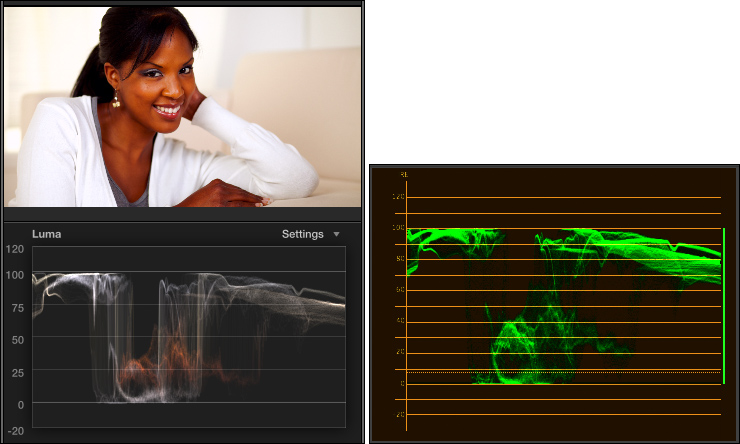
Adjust gray-scale (exposure) settings so that female black skin puts maximum highlights between 25-50% on the Waveform Monitor. In this example, her skin ranges from 20-50% on the scope.
Male black skin is darker: 15 – 35% for maximum highlights, excluding reflections from lights.
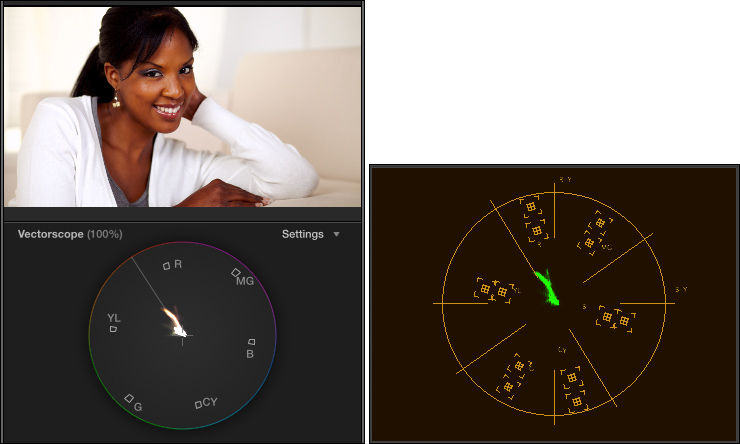
Adjust color (hue and saturation) settings so that female black skin is about 25% saturated and located directly on the skin tone line, or no more than 2° above it. Again, in this example, her hue is 2° above the line and saturation is just about perfect.
Male black skin is a bit less saturated: 10 – 20%, and also located directly on the skin tone line or no more than 2° above it.
SUMMARY
As always, there are individual variations. But, if your colors aren’t right and you want to make them better, these numbers are a good place to start.
Thanks to Pond5 (www.pond5.com) for the images used here.
EXTRA CREDIT
Explaining the process of how to do color correction takes longer than a single article can cover. If you are interested in learning more, here are three video training webinars I’ve created that can help.
31 Responses to Color Correction: Make People Look Normal
← Older Comments-
 Ty Morin says:
November 25, 2016 at 11:08 am
-
 Natalie Jackson says:
April 30, 2017 at 4:12 am
-
Final stages of ‘MUSICORUM’ | Eddy's world says:
May 30, 2017 at 9:03 pm
-
 Tim Ward says:
September 18, 2017 at 8:41 am
-
 Larry says:
September 18, 2017 at 5:25 pm
-
 Stefan says:
February 9, 2018 at 8:39 am
-
 Larry says:
February 9, 2018 at 9:44 am
-
 Karen Rodriguez says:
September 13, 2018 at 10:13 am
-
 Larry says:
September 13, 2018 at 10:36 am
-
 Karen Rodriguez says:
September 18, 2018 at 9:50 am
-
 Mohan Lakshmipathy says:
January 8, 2019 at 6:22 pm
← Older CommentsThis was so helpful. I always fumble my way through color grading at the end of a project. This really just made life so much easier. Thank you for the amount of work you put into this.
Hi Larry,
WHAT I LIKE MOST ABOUT YOUR ARTICLE – it reduces all color to grayscale and from there you give an explanation on how to fix any color. Simple. Well done. Thank you!
[…] (2017). Color Correction: Make People Look Normal | Larry Jordan. [online] Available at: https://larryjordan.com/articles/color-correction-make-people-look-normal/ [Accessed 31 May […]
Hi Larry,
I am considering switching from Media Composer (PC) to
Adobe Premiere Pro. I know you are basically a Mac guy, but I would like to know if Premiere Pro works better on Mac or PC? I have my Avid on a HP Z400, could I run Adobe on that or should I invest in a Mac or new PC?
Thanks,
Tim
Tim:
Premiere works fine on both Mac and PCs. I’d recommend staying with the computer you have.
Larry
Hi Larry,
i find it pretty hard to expose clips correctly. normally, everyone says that you have to push the highlights to 100 and the blacks to o, in order to have a nice contrast in the picture. but when i put a professional produced episode of a tv series into fcpx and activate the waveform luma, i realize, that there are often shots that are not “fully ranged”, but, for example, from 0 to 50. how do i know how far i have to push highlights and blacks?
Thanks,
Stefan
Stefan:
The short answer is that you need a “full” exposure when something is supposed to look “normal.” However, scenes at night, in clubs, in unusual locations generally mean exposures at less than full value.
The KEY during production is to do everything you can not to OVER-expose a scene. You can always make something brighter, you can’t replace data that’s been lost due to a blown-out window or excessive highlights.
Larry
Could you explain why “male dark skin” would be uniformly less bright than “female dark skin”? Wouldn’t it really depend on the individual? It’s unclear to me why females and males would have different IRE values? Does the same hold true for Caucasian or Asian/Hispanic males and females?
Thanks!
Karen:
Good question. Keep in mind that everyone is different and that these are general guidelines and that there are exceptions to every rule and, well you know, things change.
But, in general, men tend to be darker as a group than women. Not lots and lots, but 5-10% on the waveform monitor. If you have a shot you are trying to fix, and don’t have any useful reference points, my numbers will get you close. Whether this is due to differences in work habits, societal norms and pressures, Hollywood’s perception of what “normal” looks like – all these can be debated.
My goal, here, was simply to provide guidelines you can use when normal references are missing.
Larry
Thanks, Larry. I had not read that men are, in general, darker than women.
I do appreciate the resource!
Cheers,
Karen
Thanks for doing this article Larry. It was so helpful.