
 [ I am deeply indebted to long conversations with Alexis Van Hurkman for many of the ideas expressed here, as well as his excellent book: The Encyclopedia of Color Correction. ]
If you ask a colorist what they do to make actors look good on screen, they’ll tell you that they just watch the monitor and make them look “right” for the scene. While truthful, that advice doesn’t help the rest of us that don’t have their experience at seeing and adjusting color.
The purpose of this article is to give you some guidelines you can use to fix color problems to help your actors look “normal.” While every actor looks a bit different, if you have a color problem, these guidelines will help you fix it.
Just as actors wear makeup to look good on camera, we can use these guidelines to help our actors look as good as possible in post. Whether you use Apple Final Cut Pro X, Final Cut Pro 7, Adobe Premiere Pro CC, Premiere CS6, or other video editing software, these guidelines apply.
NOTE: Color grading is the process of giving a scene a specific “look.” Color correction is the process of fixing a color problem.
BACKGROUND
Color correcting human skin adjusts two elements:
Gray-scale values are indicated on the Waveform Monitor. Tweaking gray-scale values adjusts the exposure, giving the image richness and energy.
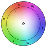
Color values are indicated on the Vectorscope. Tweaking the color values adjusts the shade and amount of color – called “hue” and “saturation” – in the image.
Generally, for consistent results, we adjust gray-scale values first, then color values.
VIDEO SCOPES
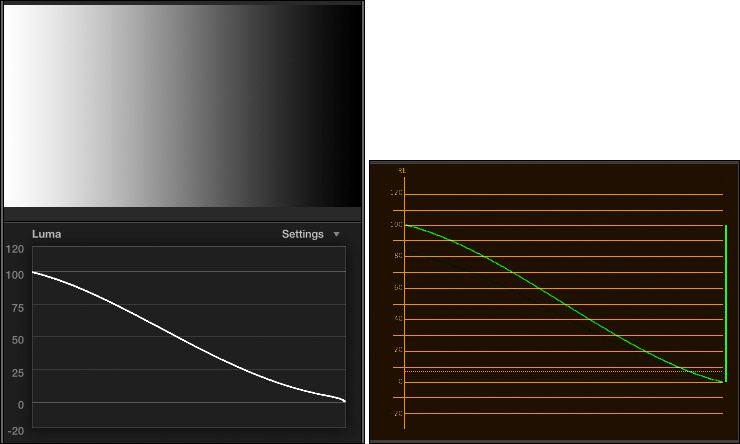
The Waveform Monitor tells us everything we need to know about the gray-scale of an image, but nothing about color. The left image is the Waveform Monitor in Final Cut Pro X, the right is the same image, using the Waveform Monitor in Premiere Pro CC. While both scopes look a bit different, they both measure the same things: image gray scale values. (The scopes in Premiere Pro CS6 look the same as Premiere Pro CC.)
On the Waveform Monitor, white is up, black is down and gray is in the middle. Moving from left to right in the image corresponds to moving left to right in the scope.
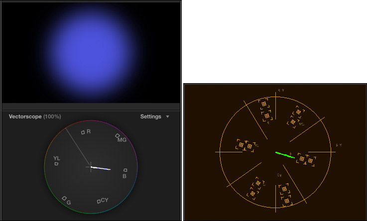
The Vectorscope tells us everything we need to know about the color of an image, but nothing about gray-scale. Again, the left image is from FCP X, while the right is the same image in Premiere Pro CC.
We use both these scopes to make informed decisions about color.
The Waveform Monitor measures gray-scale values as percentages of white, where “pure” white is 100%. The scope divides grays into seven regions:
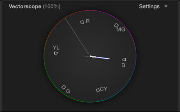
The Vectorscope measures two color values:
The six small boxes represent the three primary and three secondary colors, starting with red (near the top), then rotating clockwise to magenta, blue, cyan, green, yellow, and back to red. Here, for example, the scope illustrates a single hue (or shade) of blue, with a variety of saturations. (Red, green and blue are primary colors, while magenta, cyan, and yellow are secondary colors.)
See that line going up-left, about 10:30? That’s called the “skin-tone line.” Skin is actually gray. (You, ah, know this by checking out your dead skin in the bathroom when no one is looking.) What gives skin its color is the red blood circulating underneath. Because all of us have the same color red blood, the skin tone line represents the color of red blood under skin. The skin tone line is a very, very powerful color indicator, as you’ll see in a bit.
WHEN THINGS ARE EASY
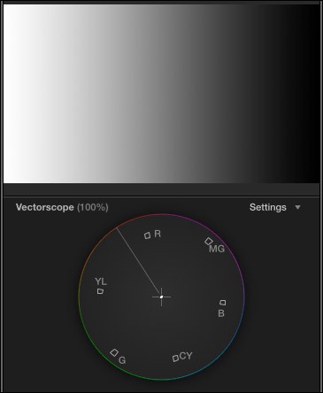
The key rule in color correction is: “If something is supposed to be gray, it should form a single dot in the center of the Vectorscope.” (Gray is composed of equal amounts of red, green and blue. Black, white, and gray are all “gray” to a Vectorscope.)
So, when life is easy, if there’s a color problem, you find something gray in the shot, isolate it with a crop and adjust the colors until the Vectorscope shows a single dot.
Easy.
Except, both you and I know “easy” never happens on a deadline.
WHEN THERE ARE NO PEOPLE IN THE SHOT
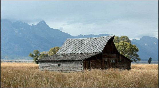
When there is no gray in the shot and there are no people in the shot, we have a lot of latitude, because no one really knows the exact colors of that mountain or barn. So we can adjust the exposure and colors however we want.
WHEN THERE ARE PEOPLE IN THE SHOT

But, where there are people in the shot, life is much more complex; because skin tone is a “memory color.” We ALL know what skin tone is supposed to look like. The problem is, how do we get there?
That’s where these guidelines come in. If all you have is a shot with messed up color and no reference grays, use the scopes and the numbers below to get you back on track.
The first thing you need to remember when color correcting is that there are no “white” people and there are no “black” people; there are only “mid-tone gray” people. Caucasian skin is about 70% of white, while black skin is about 20% of white. Neither is pure white or pure black.
The guidelines below make three assumptions:
CAUCASIAN SKIN
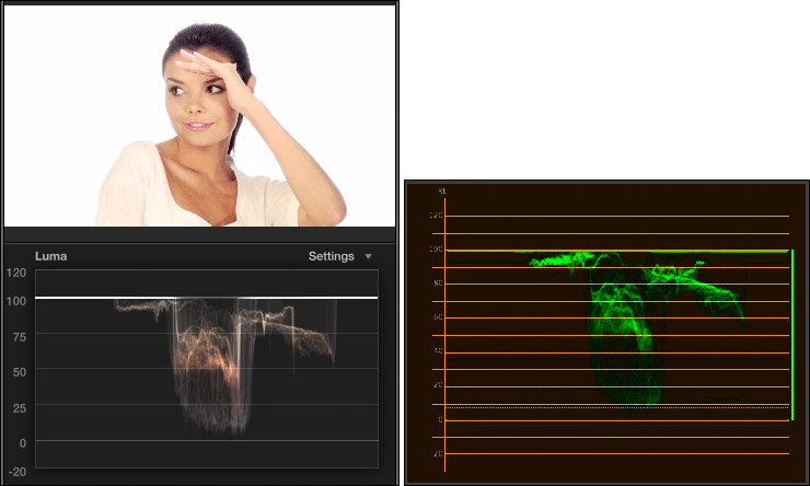
Adjust gray-scale (exposure) settings so that female caucasian skin places maximum highlights between 50 – 75% on the Waveform Monitor. In this example, her skin ranges from 50% to just under 80%, the extra highlight is caused by the edge of her hand.
Set the maximum highlights for male caucasian skin a bit darker: 45 – 65%.
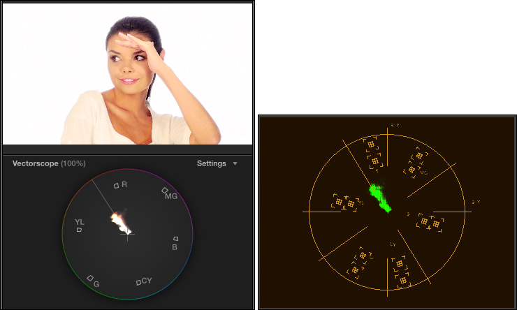
Adjust color (hue and saturation) settings so that female caucasian skin is about 40% saturated and located directly on the skin tone line or no more than 2° above it. Here, she is directly on the line with the proper amount of saturation.
Male caucasian skin is a bit less saturated: 35%, and also located directly on the skin tone line, or up to 2° above it.
HISPANIC AND ASIAN SKIN
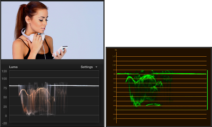
Adjust gray-scale (exposure) settings so that male or female hispanic skin puts maximum highlights between 35 – 55% on the Waveform Monitor. Here, she has the right gray-scale values, but her white headsets make the scope read a bit brighter. When trying to set a level, crop into a well lit portion of the skin so you can see the values on the scope more accurately.
Asian skin uses the same gray-scale values.
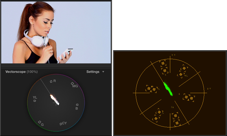
Adjust color (hue and saturation) settings so that male or female hispanic skin is about 30 – 35% saturated and located directly on the skin tone line, or no more than 2° above it. Again, in this example, hue and saturation are just about perfect.
Asian skin has the same saturation, but located on the skin tone line or no more than 2° below it.
BLACK SKIN
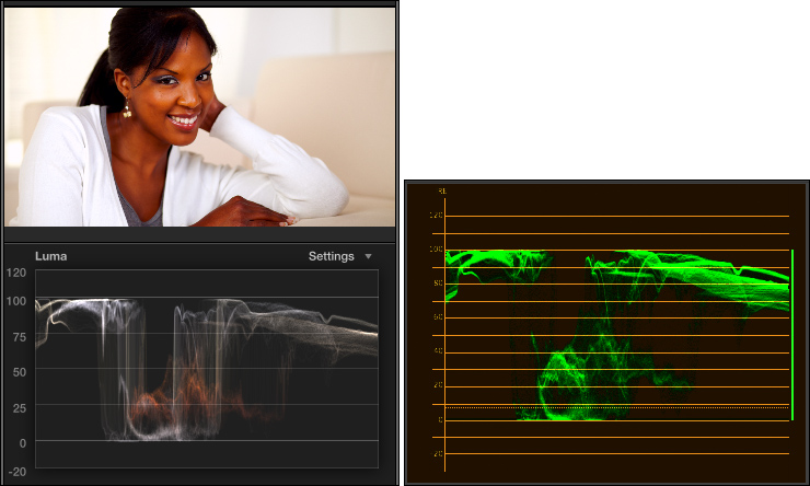
Adjust gray-scale (exposure) settings so that female black skin puts maximum highlights between 25-50% on the Waveform Monitor. In this example, her skin ranges from 20-50% on the scope.
Male black skin is darker: 15 – 35% for maximum highlights, excluding reflections from lights.
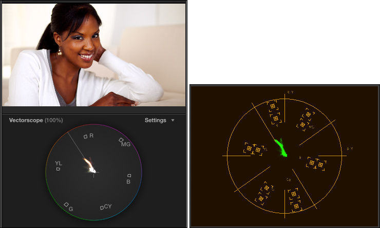
Adjust color (hue and saturation) settings so that female black skin is about 25% saturated and located directly on the skin tone line, or no more than 2° above it. Again, in this example, her hue is 2° above the line and saturation is just about perfect.
Male black skin is a bit less saturated: 10 – 20%, and also located directly on the skin tone line or no more than 2° above it.
SUMMARY
As always, there are individual variations. But, if your colors aren’t right and you want to make them better, these numbers are a good place to start.
Thanks to Pond5 (www.pond5.com) for the images used here.
EXTRA CREDIT
Explaining the process of how to do color correction takes longer than a single article can cover. If you are interested in learning more, here are three video training webinars I’ve created that can help.

2,000 Video Training Titles
Edit smarter with Larry Jordan. Available in our store.
Access over 2,000 on-demand video editing courses. Become a member of our Video Training Library today!
Subscribe to Larry's FREE weekly newsletter and
save 10%
on your first purchase.
32 Responses to Color Correction: Make People Look Normal
Newer Comments →-
 Constance says:
March 10, 2014 at 1:27 pm
-
 Don B. Cely says:
March 13, 2014 at 3:28 pm
-
 Valerie says:
March 25, 2014 at 9:47 am
-
 Larry Jordan says:
March 25, 2014 at 11:11 am
-
 Valerie says:
March 26, 2014 at 11:32 am
-
 Valerie says:
March 28, 2014 at 5:25 am
-
 Larry Jordan says:
March 28, 2014 at 8:54 pm
-
 Rodrigo says:
July 15, 2014 at 6:44 am
-
 Rick Nendepa says:
September 10, 2014 at 10:30 pm
-
 atom says:
January 10, 2016 at 2:08 am
-
 Martin says:
May 29, 2014 at 2:57 pm
-
 Arianna says:
September 10, 2014 at 3:25 am
-
 LarryJ says:
September 10, 2014 at 7:07 am
-
 Steven Galvano says:
August 10, 2016 at 11:16 am
-
 Larry Jordan says:
August 10, 2016 at 12:18 pm
-
 Steven Galvano says:
August 10, 2016 at 6:21 pm
-
 Jan says:
September 12, 2016 at 8:29 am
-
 Larry says:
September 12, 2016 at 8:52 am
-
 Jan says:
September 12, 2016 at 9:51 pm
-
 Larry says:
September 12, 2016 at 10:00 pm
Newer Comments →Just what I needed, a refresher on color correction. Thank you!
Excellent article. Probably the best proper exposure guide for me as a cameraman as well as an editor trying to “fix it in post.”
Thanks for an informative and accessible article.
This is a great article, a really helpful overview, and especially I applaud you for giving information about various ethnicities, I was particularly searching for that. I’m wondering why you state that male black people are darker and less saturated than femaie black people. Although you add that there are individual variations and the percentages you give are good starting places, I’m a little confused why the starting place would assume that most black men are darker and less colorful than most black women.
Valerie:
Well, I had to start somewhere. Clearly, there are differences. However, currently in style and fashion, men – both white and black – tend to be darker than women.
As examples, take a look at movie posters and magazine ads – clearly, not reality, but, as I said, a place to start.
Larry
Ok, thanks, that clears it up. I work on a lot of documentary projects and often that means a different aesthetic than popular culture outlets like movies, commercials and magazines, so it helps to know where you’re coming from. I do appreciate your article, I think it will be helpful in my work.
After thinking about this some more, I want to add that although I realize you include in your article’s title the phrase “Make People Look Normal” because you want to explain how to avoid skin tones looking greenish or bluish, to then go on to say that people of color should be corrected to some standard of lightness, to give actual percentages as a guide under the heading of making people look normal, is to perpetuate hurtful messages that lighter skin is prettier skin. You can choose to be part of the system that promotes that ‘lighter is better’, but it might be nice if you mention that it’s only one way to approach color correction of human skin. If I’m color correcting a documentary in which a black woman is relating her experiences with discrimination in institutions of higher learning (a real example), then the worst thing I could do would be to color correct her skin to be several shades lighter than it actually is.
Valerie:
Thanks for your comments, but NOWHERE do I say that “lighter is prettier.” Lighter is lighter. Darker is darker. Because skin tones are variations of both gray scale and color, we need to look at both the Waveform Monitor and the Vectorscope to make determinations on how to set skin colors.
Far too often, cameras are not properly balanced to match the color of the lighting, causing video recordings to have a blue cast or orange cast. Or the image is over- or under-exposed. In all cases, we need to correct for errors in photography so that our actors or interview guests look similar to the way they do in real life.
My suggested gray-scale values enable us to compensate for camera errors to make our on-camera folks look as good as possible. You are correct in that each of us is a bit different, but if everything in the image is blue, these settings can help you remove the blue and make skin tones look “normal.”
Larry
Thank you very much for this great article!
Very helpful reminder and learning source.
Valerie, your interpretation is quite the opposite of mine, since part of the value of the article lays in Larry’s tips to make each group maintain its particular nuances with general guidelines. We are talking use of waveform and vectorscope to correct camera “errors”, as simple as that. If I were Larry, now I would feel hurt. Defending from a non existing attack becomes a new attack, one should be careful. Myself, I am a bloody mess of ethnicities, Hispanic, Indian and black, so I am going to load up a nice frame of myself and have some fun!
(Sorry if my English is not so good, it’s my third language)
Thanks again Larry!
Whoa Valerie, chill. 😀 I’m dark and I didn’t read Larry’s article that way at all. I’m sure this will help you a lot. Try producing an image of someone who’s extremely dark that reflects age, wisdom and experience (because the story needs it) when you can’t even bring out the wrinkles on their face, when someone much lighter is in the same frame! Very difficult!
Larry,
thanks heaps for the time you took to putting your knowledge and experience into this article.
Where I’m from, documentary filmmaking can be quite difficult due to the vast range of skin tones we have here (different “complimenting” lighting requirements etc). We have tones ranging from very fair (almost Caucasian) to pitch black (seriously). At least a third of our work is verite which can lead to a lot of fixing in post. Only got into the post production side of things this year, and I’ve been struggling for months to get my head around color correcting for skin without messing everything else up. I don’t like grading to conceal some of my shortcomings in correcting which is what I do sometimes (hope that made sense), and your article has cleared a lot up for me.
Thanks heaps! I’m gonna get back to the office now and practice on some old footage!
Cheers,
Rick.
Valerie needs to quit smoking paint-chips. Thanks for a great article!
Hi Larry,
I always wonder about differences in memory color and real skin color. Above pictures seem to be very saturated and I would guess that they represent more or less memory color of skin. Please find at http://www.liftgammagain.com/forum/index.php?threads/saturation-of-natural-skin.2151/ an approach from where I created a tool for analyzing skin saturation in correlation with luminance.
If I analyse natural skin from http://humanae.tumblr.com/ the curve with Sat max 25% fits in most cases. Analysing general skin publshed by photographers within internet will show very often higher saturated skin similar described by you findings.
Hi,
congratulations for the article.
A question: is it possible to correct a video in a limited area:
for example, the color of the blush on her cheeks that makes them look like two bruises?
Thanks.
Arianna:
Yes. Its called a “secondary color correction.” Premiere, FCP 7 and FCP X can all do it.
I show how in my color correction webinars:
http://www.larryjordan.biz/app_bin/Store/catalog/advanced_search_result.php?keywords=correct&x=-720&y=-215
Larry
Thanks Larry.
I have a related question…
We shot an interior scene, it was well lit, but shot in with an exterior white balance setting. Obviously, everything looks super yellow.
Is there a straight forward way of correcting this scene for Tungsten lights?
I’m using FCPx and using native tools is always preferred.
Many thanks all!
Steven:
See if this video can help:
https://larryjordan.com/articles/fcp-x-color-correct-orange-skin-tones-video/
Larry
Many thanks, Larry.
The corrected footage looks brilliant…. phewwwww
Thank you Larry, this tutorial really helped me to adjust skin tones in FCPX! I really love the results.
One question yet remains for me (sorry if this is too beginnerish):
in order to perform the skin tone adjustment, i crop to a region that contains only skintones (mostly the mid part if possible), so that i see the vectorscope dedicated for the skin tone itself, otherwise it gives me the vectorscope of the complete image, which doesnt help at all (?). Then i use the color board and adjust the global color so that it is on the skin tone line, like you suggested. But how do I see if the saturation is at, lets say 40% for female caucasian skin? I know that within the vector scope, the rectangles next to the 6 colors are like 100%, so do i just have to somehow hope/guess that i am at 40% or is there a tool that i am missing?
Jan:
You are correct, there’s no “specific” measurement that says 40%, or 38.796%. On the other hand, that level of precision isn’t necessary. The key is the angle – skin tones need to be really close to that line. Saturation will depend on a wide variety of factors, including lighting and story, so the percentages are guides, not precise settings.
Larry
Thanks Larry! When I set my crop to an area with skin tones, it typically contains a varriety of tones, e.g. darker skin tones due in the shadows as well as higher skintones n the highlights. As a result, when cropping to this area I dont get just one fine line that I can put exactly on the skin tone line, but a wider spectrum of values. What is the right approach in such a case? You said for caucasian skin it should not be more than 2degrees above it, so this means in my case, I shift the spectrum of skin tones more to the area of yellow?
Also, can you recommend any of your paid tutorials that help to understand my knowledge in color correction as well as the area of skin tones? You got so many..
Jan:
You want to select well-lit, but not over-exposed skin. I generally work with faces, not foreheads, which often have speculars. Arms or legs, as long as they are well lit, are good as well. You don’t need a big area, just big enough that you can see the trace on the scope.
I have LOTS of training on color correction. Go here: https://larryjordan.com/store/ and set the Category popup to Color. Pick a session that relates to the NLE you are using. All of them are good, and the store page includes a content outline so you can pick the title with the content you are most interested in.
Larry