 I’ve heard the term “Hype Cycle” for several years now, but finally decided to track it down.
THE FIRST HYPE CYCLE
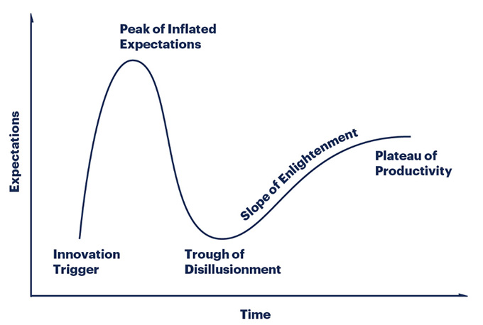
The Gartner Group invented the first Hype Cycle chart sometime around 2000. Since then, it has developed a life of its own.
 (Image courtesy of Gartner.)
As described by Gartner, this chart represents the stages that new technology goes through to reach the market.
“Gartner Hype Cycles provide a graphic representation of the maturity and adoption of technologies and applications, and how they are potentially relevant to solving real business problems and exploiting new opportunities. Gartner Hype Cycle methodology gives you a view of how a technology or application will evolve over time, providing a sound source of insight to manage its deployment within the context of your specific business goals.” (Gartner website)
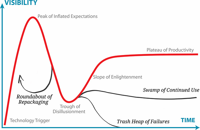
 (Image courtesy of David Algoso.)
The chart has been adopted by many others to help explain the evolution of technology. For example, this second chart is from David Algoso, a social change strategist. He published this image in January, 2015, as an elaboration on Gartner. Here’s a link to David’s website.
The problem with these Hype Cycles, as Wikipedia outlines them, is that “it is not a cycle, that the outcome does not depend on the nature of the technology itself, that it is not scientific in nature, and that it does not reflect changes over time in the speed at which technology develops. Another is that it is limited in its application, as it prioritizes economic considerations in decision-making processes.” (Wikipedia)
Still, these charts are fun to look at and consider, even if they are not a rigorous decision-making tool.
TECHNOLOGY READINESS LEVEL
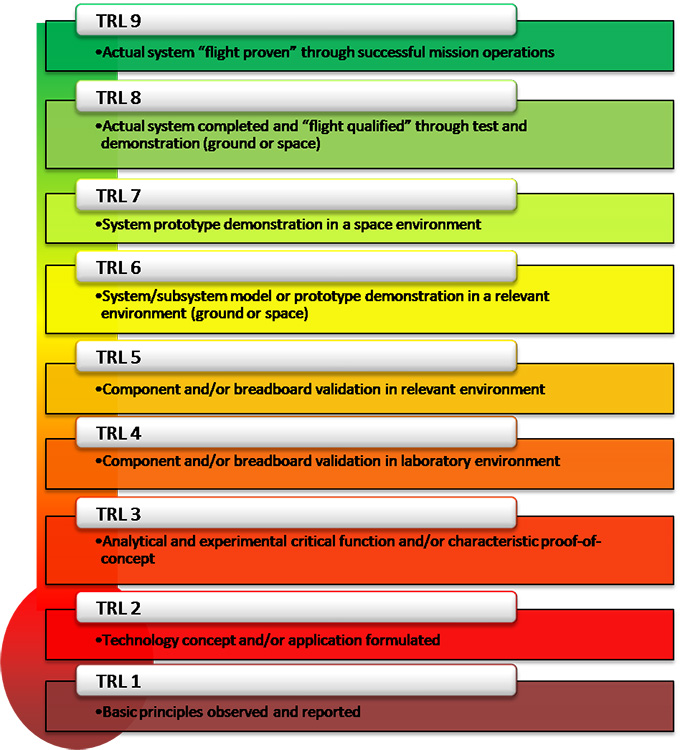
 (Image courtesy of NASA.)
A better option may be a system devised by NASA called the “Technology Resource Level” (TRL)
“A NASA researcher, Stan Sadin, conceived the first scale in 1974. It had seven levels which were not formally defined until 1989. In the 1990s NASA adopted a scale with nine levels which gained widespread acceptance across industry and remains in use today.” (NASA website)
NASA’s website defines these levels as:
Here’s a link to NASA’s explanation of what these mean.
HOW DOES THIS AFFECT US?
Technology is a moving target. New ideas are continually promoted at “the next great thing.” However, the landscape is littered with great ideas that, over time, did not prove to be very great at all. As we rush toward the annual NAB Show, with all its breath-taking exhibits, it is good to keep this in mind.
I found these charts helpful in realizing that not all ideas are created equal and, as technology consumers, it can be helpful to balance our hope for a solution with the reality that a specific technology can actually solve our problem.