 Blend modes allow us to combine the textures of two images by combining their gray-scale values. Most often, we use this technique to make text look more “integrated” or “organic” with the background.
The cool thing about blend modes is that you either like the effect, or you don’t, there’s nothing to adjust. But, when it comes to making your text look less “texty,” nothing is easier or more fun to apply.
NOTE: Blend modes can be applied to any image – feel free to experiment.
GET STARTED
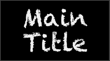
Here’s the image we’ll be using for this article. 250 point Chalkduster, created in the Title tool in Premiere Pro CC (2014).
NOTE: Blend modes are supported in many versions of Premiere so, while I’m illustrating these using the latest version, you’ll find them in whatever version of Premiere you are using.

In fact, I’ve created three versions of this text in white, yellow and blue.
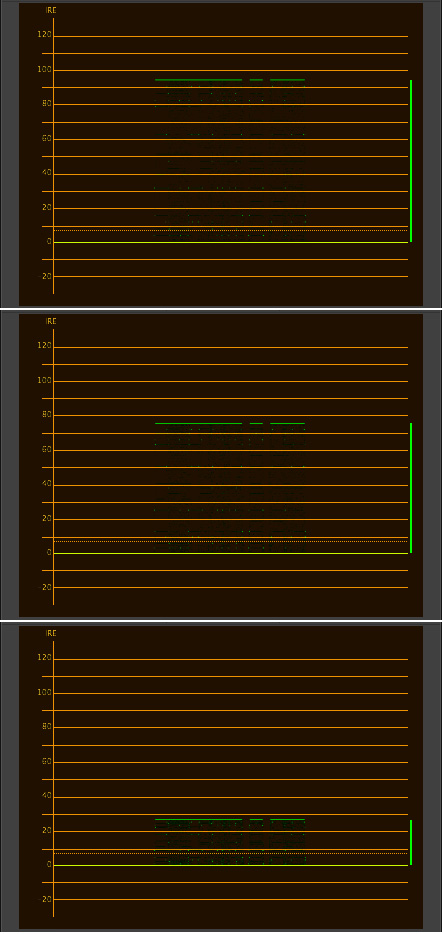
If we look at these three text clips on the Waveform Monitor, the white text has a gray-scale value of 95%, yellow is about 76%, while the blue is around 27%.
These gray scale differences are important, because blend mode results change based upon gray scale and color values; as you’ll see.

Using blend modes requires that your text (or whatever clip you want to apply blend modes to) is placed above a background layer. Here, for example, my three text clips are placed above a variety of wood textures, which we’ll use for the background.
Blend modes are ALWAYS applied to the top clip in the stack; which in this case is the title text.
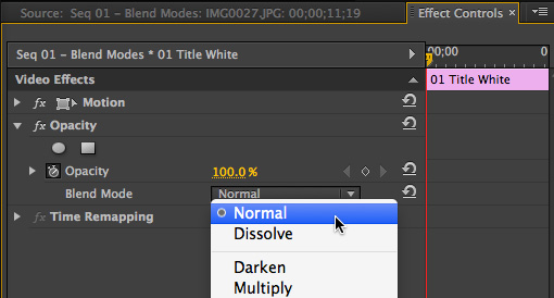
To apply a blend mode, select the text clip in the Timeline, then open the Effect Controls panel (shortcut: Shift+5).
Twirl down Opacity and click the popup menu next to Blend mode. Select the blend mode you want to apply and decide if you like the results.

There are five categories of Blend Modes, generally described by their principle effect:
My favorite effect, and the one I try first, is Overlay.
WHY USE BLEND MODES?
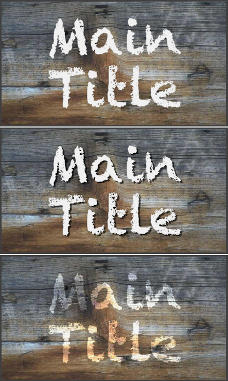
Here’s the reason to consider blend modes. The top image is the text superimposed over the textured background. The second image applies a drop shadow. The third image applies the Overlay blend mode.
The text by itself is fine and the drop shadow makes it totally readable. What the blend mode does, though, is make the text look like it was spray-painted on the wood. The colors and textures of the two surfaces combine to form an integrated new image. It is this combining of textures that makes blend modes desirable. For readability, use drop shadows — to seamlessly blend two images, use blend modes.
In the next section, I’ll show you examples of blend modes using different settings and different colors and gray-scales of text.
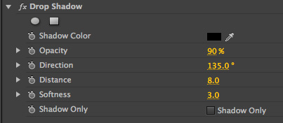
NOTE: Personally, I don’t like Premiere’s drop shadow settings. So, here are the drop shadow settings I used on the second image above. I use these settings whenever I want my text to be clearly readable.
BLEND MODE EXAMPLES
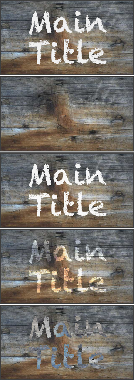
Here are five blend mode examples, from top to bottom:
Because the text is white, there are no dark pixels in the text clip for Multiply to work with, so the text disappears. Screen, which requires light pixels in both clips, doesn’t have any pixels from the background which are lighter than the text clip, so the background does not appear inside the text.
Overlay and difference both yield interesting results, but nothing to write home about. The basic rule is that when you are working with blend modes don’t use white or black in your text; use gray-scale values closer to 50%.
Here are five more blend mode examples, this time using a clip which is light, but not white; in fact, the gray-scale value is around 75%. Again, from top to bottom:
Notice the differences in the effect when the gray scale drops below white. Notice how we see texture from the underlying background start to appear within the text.
Notice, also, that the chalk-like text in the typeface reinforces the feeling of text spray-painted on the wood. Just as using different gray-scale values yield different results, so does using different fonts.
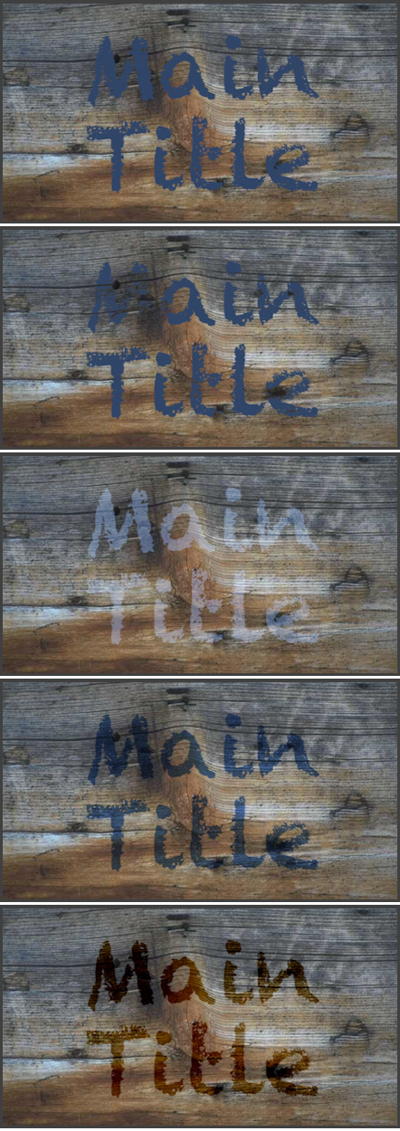
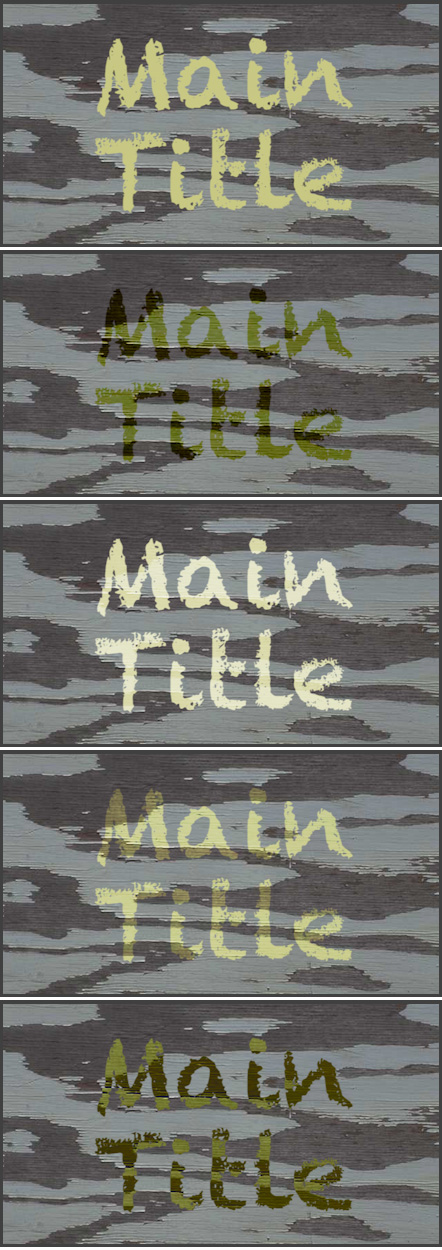
Here are five more blend mode examples, this time using a clip which is darker, but not black; in fact, the gray-scale value is around 25%.
Look carefully at the top two images. Notice in the top image, the color of the text totally blocks the texture below, while in the second image, the cracks in the wood also appear as cracks in the text. To me, the text in the second image is more believable and interesting than the text in the top image.
For me, gray-scale values from 30-50% in the text clip yield the most interesting results. Again, each effect is different, based upon the foreground and background clips.
EXTRA CREDIT
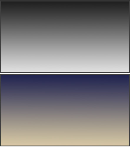
Just as we can use blend modes with text, we can also use blend modes with images. Here are two gradients, created in Photoshop.
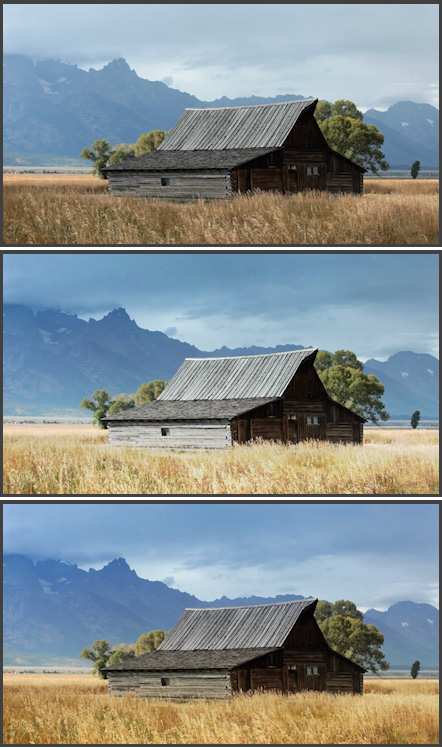
Look at the results of applying these two gradients to the same scene using an Overlay blend mode. The native image is at the top, the gray-scale gradient, in the middle, pulls detail out of the sky, while brightening the foreground. (This is similar to putting a grad filter in front of the camera lens.)
The bottom image, using the color gradient, pulls detail out of the sky while warming and brightening the foreground. This is a killer effect for many landscapes. Very cool!
Your results will vary as you change the colors and intensity of the gradient. (Yup, you can have hours of fun playing with these!!)
SUMMARY
Blend modes are used when you want to combine textures between two different clips – from text to backgrounds to video clips themselves. Because there is nothing to adjust, these are easy to work with: simply apply the setting and see if you like the results.
I guarantee that the more you play with these, the more uses you’ll find.
2,000 Video Training Titles
Edit smarter with Larry Jordan. Available in our store.
Access over 2,000 on-demand video editing courses. Become a member of our Video Training Library today!
Subscribe to Larry's FREE weekly newsletter and
save 10%
on your first purchase.